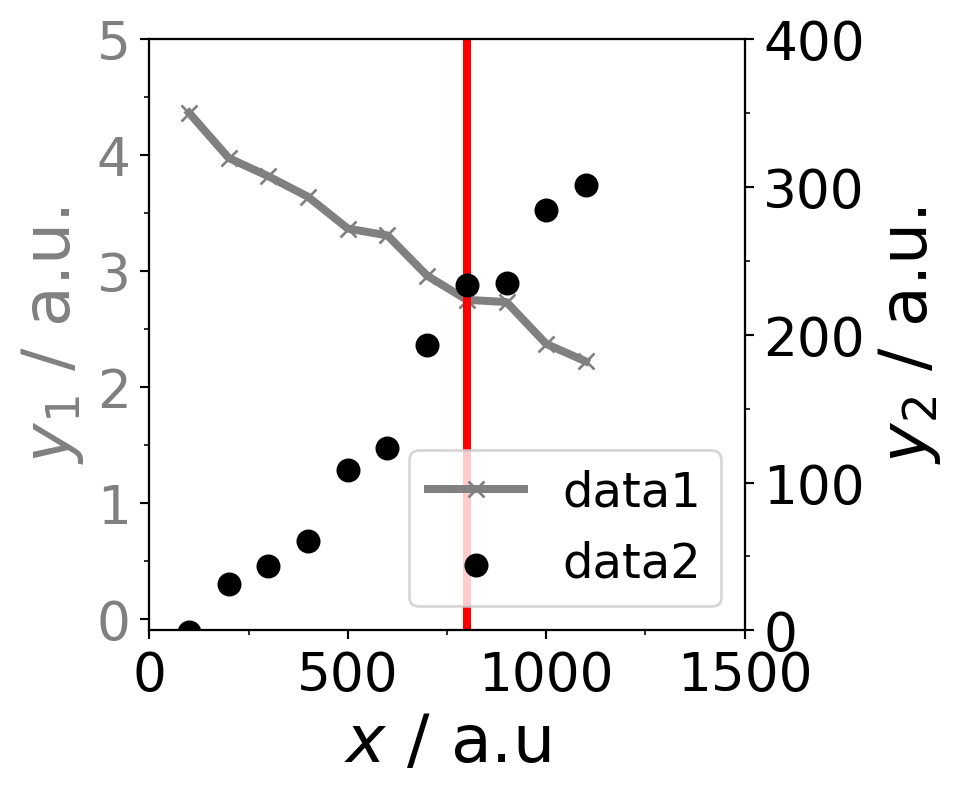
import matplotlib.pyplot as plt
from matplotlib.ticker import AutoMinorLocator,FixedLocator


# global matplotlib settings
plt.rcParams.update({
    'legend.fontsize': 18,
    'figure.figsize': (4, 4),
    'axes.labelsize': 25,
    'xtick.labelsize': 20,
    'ytick.labelsize': 20}
)

# create a figure with a subfigure to create 2 different y-axes
fig, ax1 = plt.subplots()
# create second subfigure with with sharing the x-axis of ax1 subfigure
ax2 = ax1.twinx()
# plot the first data as line plot as ax1 subfigure
# set color, linewidth, marker symbol and label
ax1.plot(data[:,0], data[:,1], color="grey", linewidth=3, marker="x",label="data1")
# define the color of the y-axis
ax1.tick_params(axis='y', labelcolor="grey")

# plot the second data as the ax2 subfigure by using scatter plot
ax2.scatter(data[:,0], data[:,2],color="black", linewidths=3,label="data2")
ax2.tick_params(axis='y', labelcolor="black")

# add all labels in one
lines1, labels1 = ax1.get_legend_handles_labels() # get labels of ax1 subfigure
lines2, labels2 = ax2.get_legend_handles_labels() # get labels of ax2 subfigures
ax2.legend(lines1 + lines2, labels1+ labels2, loc=4) # location of legend

# set x- and y-limits of the axes
ax1.set_xlim(0,1500)
ax1.set_ylim(-0.1,5)
ax2.set_ylim(-0.1,400)

# set the x- and y-labels of the axes
ax1.set_xlabel(r"$x$ / a.u")
ax1.set_ylabel(r"$y_1$ / a.u.",color="grey") # define also the color of the labels
ax2.set_ylabel(r"$y_2$ / a.u.",color="black")

# create a vertical line at 800 starting from 0 until 5
ax1.axvline(800,0,5,color="red",linewidth=3)

# define manjor and minor axes ticks
ax1.xaxis.set_major_locator(FixedLocator(np.arange(0, 2000, 500)))
ax1.xaxis.set_minor_locator(AutoMinorLocator(2))
ax1.yaxis.set_major_locator(FixedLocator(np.arange(-1, 6, 1)))
ax1.yaxis.set_minor_locator(AutoMinorLocator(2))
ax2.yaxis.set_major_locator(FixedLocator(np.arange(-100, 500, 100)))
ax2.yaxis.set_minor_locator(AutoMinorLocator(2))

# save the figure as png
# plt.savefig("figure.png", dpi=300)
# show the picture
plt.show()